Self-Initiated UX Exploration: Mobile Pregnancy & Maternity App | B2C | Healthcare
Momly
Designing coordinated care and support application to help solve maternity care crisis

Project type
Self-Initiated UX Exploration
Duration
5 months
Tools
Figma, Photoshop, Procreate, LottieFiles, Jitter
One Minute Case Study Digest
Problem
The U.S. faces a growing maternity care crisis.
Digital solutions remain very abundant, but the care offered is fragmented and incomplete, leaving mothers overwhelmed and stressed.


Solution
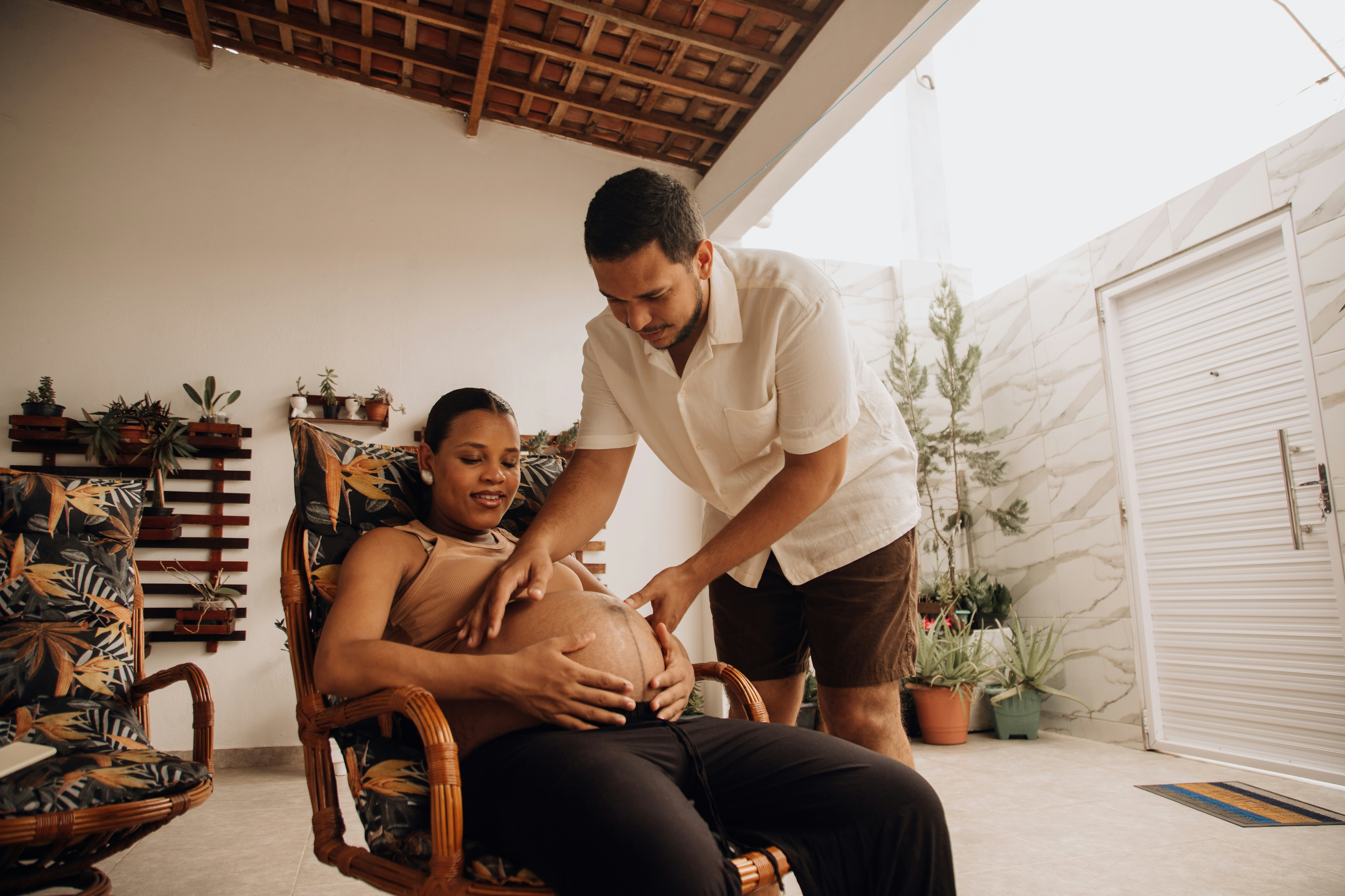
Momly — a human-centered mobile pregnancy & maternity app that offers care services and tools, such as a cross-functional team of medical (nurses, midwives) and non-medical (doulas, community health workers) professionals managed by a Care Coordinator, personalized library of resources and AI-powered empathic voice-activated & voice-controlled navigation to allow for hands-free app use and deliver greater accessibility.


Care Team Accessibility

Personalized Library of Resources

Curated Content Delivery for Each User

AI-powered Voice-Activated & Assisted Navigation

Comprehensive Case Study
The Brief
This case study highlights how I designed a human-centered maternity care app that combines empathic voice navigation, coordinated care teams, and personalized resources to address gaps in U.S. maternal health.
It is my passion femtech project that details how I conceptualized, researched, and applied technical UI & UX skills to the problem.
Research & Development: The Business of Birth
Initial Problem Discovery
What problem am I trying to solve?
Digital pregnancy & maternity apps remain incomplete, fragmented and require a lot of managing by a user.
Why is this problem important?
Maternal mortality rate has more than doubled since 1990 and is the highest among the developed countries.
The U.S. has a relative undersupply of maternity care providers, especially midwives, and lacks comprehensive postpartum support.
Mothers' lives matter.
User Research
Research plan for a data-driven solution
Main pain points that where revealed from user research

Feature Prioritization & MVP
I evaluated the competitor-apps that represented the most frequent business models in the market of maternity apps: freemium, subscription-based, partnerships with healthcare providers, and e-commerce integration models.
Next, I aligned the selected subscription-based business model with the design goals to formulate the app's primary differentiators and value proposition.

How might we…
Redesign the pregnancy & maternity experience to make mothers feel better assisted, cared for and comfortable during their journey?
How to address maternal mortality crisis with a pregnancy & maternity app?
How to address maternal mortality crisis with a pregnancy & maternity app?
Concept proposal
A mobile pregnancy & maternity app that offers greater managed care and top services to cover the gaps in peri- and postnatal services.
Value propositions
A dedicated team of medical (nurses, midwives) and non-medical (doulas, community health workers) professionals provides personalized maternal care; the team is managed by a Care Coordinator.
Library of resources delivers personalized educational and coaching resources.
AI-Powered Empathic Voice-Activated & Voice-Controlled Navigation to allow for hands-free app use and deliver greater accessibility.
Primary differentiating features of the app
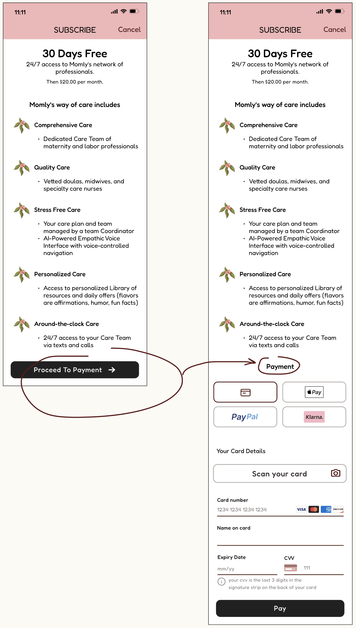
Seamless connection with healthcare providers for personalized medical advice and appointment scheduling (24/7 texting to care team members)
Managed Care Integration
A dedicated team of medical (nurses, midwives) and non-medical (doulas, community health workers) professionals managed by a Care Coordinator
Cross-Functional Care Team + Care Coordinator
Structure
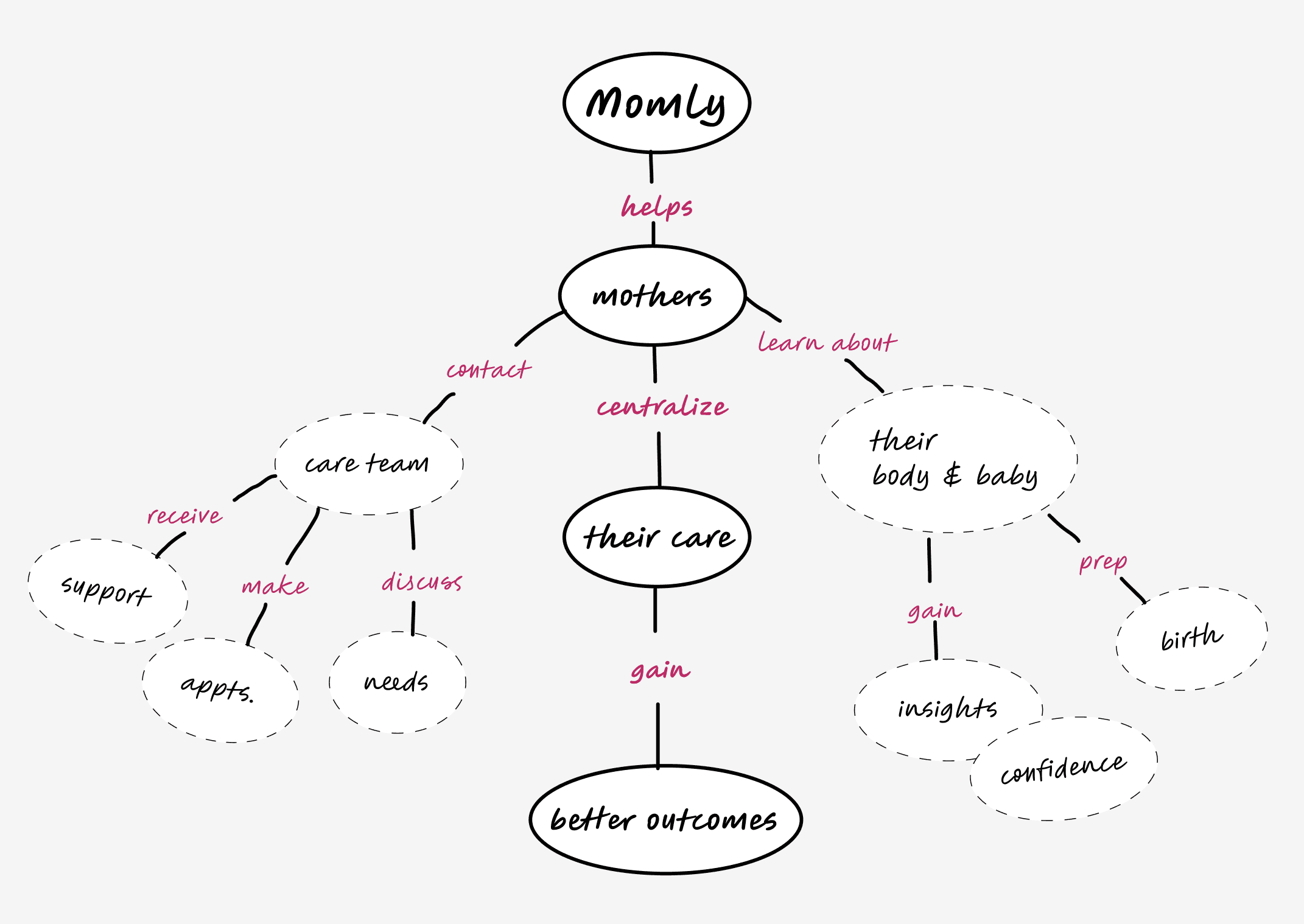
I built apps' concept map, then I created user flows and app map to define and visualize the structure, content, feature organization, and app navigation.
Concept map
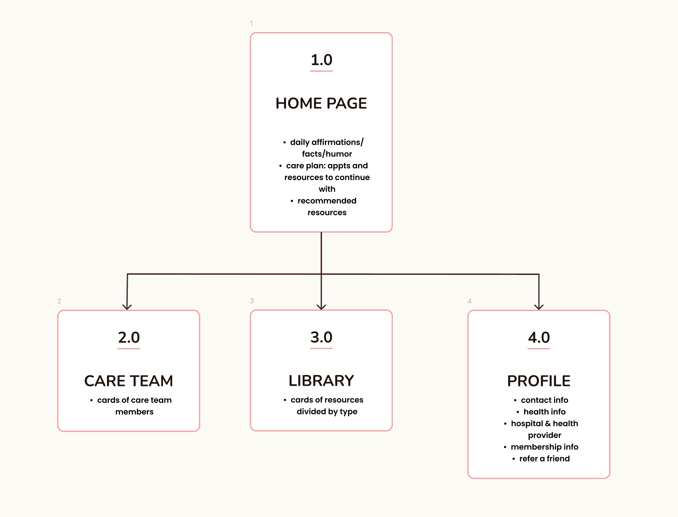
App Map
I was able to narrow down the scope of the app design effort and convey it in this preliminary app map.
App map
Design Studies: Softness & Simplicity
Visual Design
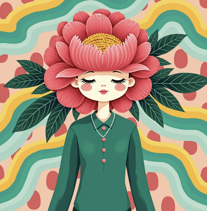
Logo
Pink peony flower is incorporated into the logo due to its beauty and the following symbolism:
emotional symbolism: embodiment of beauty, compassion, and tenderness;
historical symbolism: in Greek mythology, it is associated with healing and medical practices.
Style Tile
For the visual layer of Momly's design, I consulted the psychology of color and chose soft, welcoming, and warm colors in their neo-retro treatment (saturation/hue).


Testing & Iterations
Design Iterations
Add Strategic Color Differentiation to Improve Visual Clarity & Reduce Cognitive Load
Users expressed a need for clear visual distinction between user's input and Momly's peony avatar responses. I modified text color for user input and introduced a green background for user messages.

Match Users' Mental Models & Enhance Visual Design
Users felt that the search feature should be more "obvious". I transformed search icon into a more visible search window and repositioned search element to improve prominence and accessibility.
I also redesigned resource card visuals to create cleaner, more streamlined interface and minimized color cognitive load.

Add Labels for Clarification and Accessibility
I added "Team Member" label to member's profile page for clear role identification, and removed extraneous logo and utility icons to reduce visual complexity and minimize cognitive load of users.

Lower a Number of Steps
I merged two screens into one to streamline the membership function process, reducing the number of steps required.
Peony Avatar for Momly's AI-Assisted Empathic Voice-Controlled Navigation
Pink peony flower is an ideal symbol for Momly's AI assistant as it represents healing and beauty and app's UI attributes.
In selecting the avatar, I intentionally chose to avoid overly anthropomorphic designs to prevent the introduction of any racial or ethnic biases. The chosen Peony design strikes a perfect balance between anthropomorphic and non-anthropomorphic.
The various considered avatars for Momly's AI-assisted empathic voice-controlled app navigation


WWW, or What Went Wrong
Some points of tension that I encountered while working on design iterations and preference tests:
Removal of social share/community features.
I decided to remove the community feature in order to prioritize other vital features and reduce potential distractions for users, despite risking lower user engagement. The focus is on a support from Care Team and not one's peers.
Team vs Services.
I debated what option - Care Team or Services - should be displayed in the navigation. In the end, I went with Care Team in order to emphasize human connection, facilitates direct access and enhances personalization of care for specific needs of each mom.
Lacking Illustrations and interactive elements.
To reflect Momly's identity and style to my satisfaction, I had to negotiate between free/paid/diy illustrations and other visual elements.
Results: Momly. Care for Moms. From Pregnancy to Baby.
Momly App Demo
My Learnings
1. Personalization trumps generalization.
By implementing AI-driven content tailoring based on a progression of pregnancy, health conditions, and personal preferences, I'd expect high daily activity of users, long session duration, and high overall users' satisfaction.
2. AI-driven voice control revolutionizes accessibility.
Implementing voice-activated features in Momly app is expected to increase user adaptation and engagement among expectant mothers, especially mothers with mobility challenges or visual impairments. This hands-free interaction not only improved app usability but also empowered users to access critical information and track their pregnancy progress more independently.
Reflections & Personal Takeaways
This project reaffirmed my passion for the intersection of technology and health care. The power of femtech can transform not only maternal care, but also the entire spectrum of women's health across their lifespans.